Local church website redesign
UX/UI Design and development
Project Overview
Summary
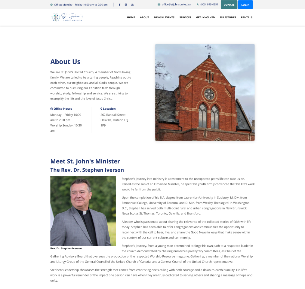
The church’s original website had become increasingly ineffective due to poor organization, making it difficult for visitors to find important information and for staff to manage content efficiently. With a largely aging membership, the church recognized the need for a new, accessible modern design that could better engage and attract younger audiences while still serving its existing community. Additionally, maintaining the site had become a significant challenge because the existing page builder lacked the flexibility and functionality required for their evolving needs. This led to the decision to redesign the website using a more adaptable CMS solution that would streamline updates, improve usability, and support future growth.
Client
St. John's United ChurchResponsibilities
- UX/UI Research
- Paper and digital Wireframes and prototypes.
- Web development
Status
In progress
The Problem
The usability of the website presented several challenges. Navigation was confusing, with many links not functioning properly, which made it difficult for users to move through the site. Content was not grouped effectively and lacked a clear hierarchy, further complicating the browsing experience. Accessibility was also an issue, as many images containing text did not include alt tags, and the fonts used throughout the site were often too small and hard to read.
In addition to usability concerns, the site suffered from technical problems. For example, the member login process frequently redirected users to a blank page, creating frustration and limiting access to important features. Administrative tasks were also cumbersome, as the site was built using a WordPress Lite page builder that offered limited flexibility. This made it difficult to maintain, update, and expand the site with new content.
The Goal
- Improve overall user experience
- Improve the member experience
- Increase revenue
- Simplify the process for the client to update and maintain the website.
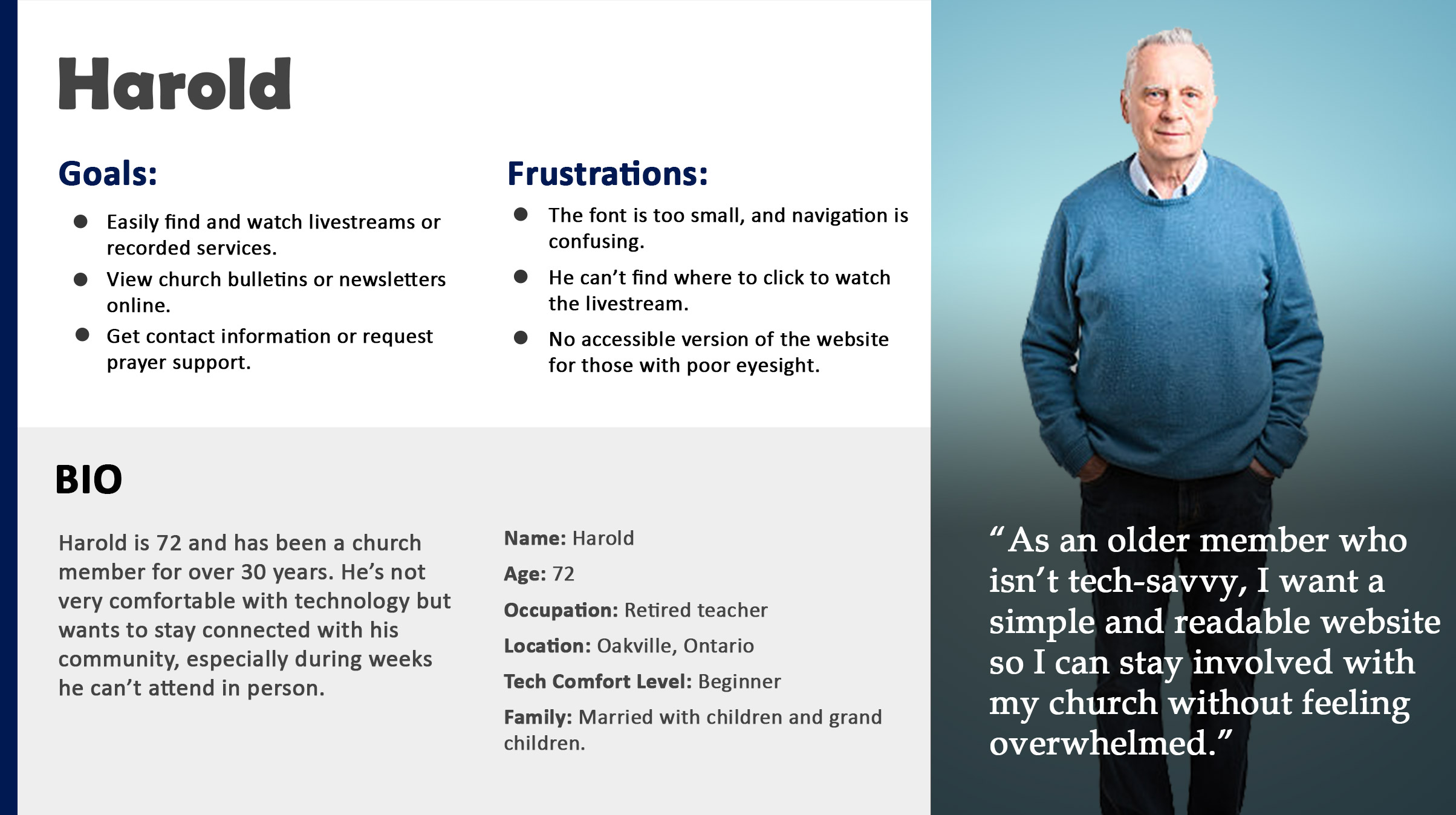
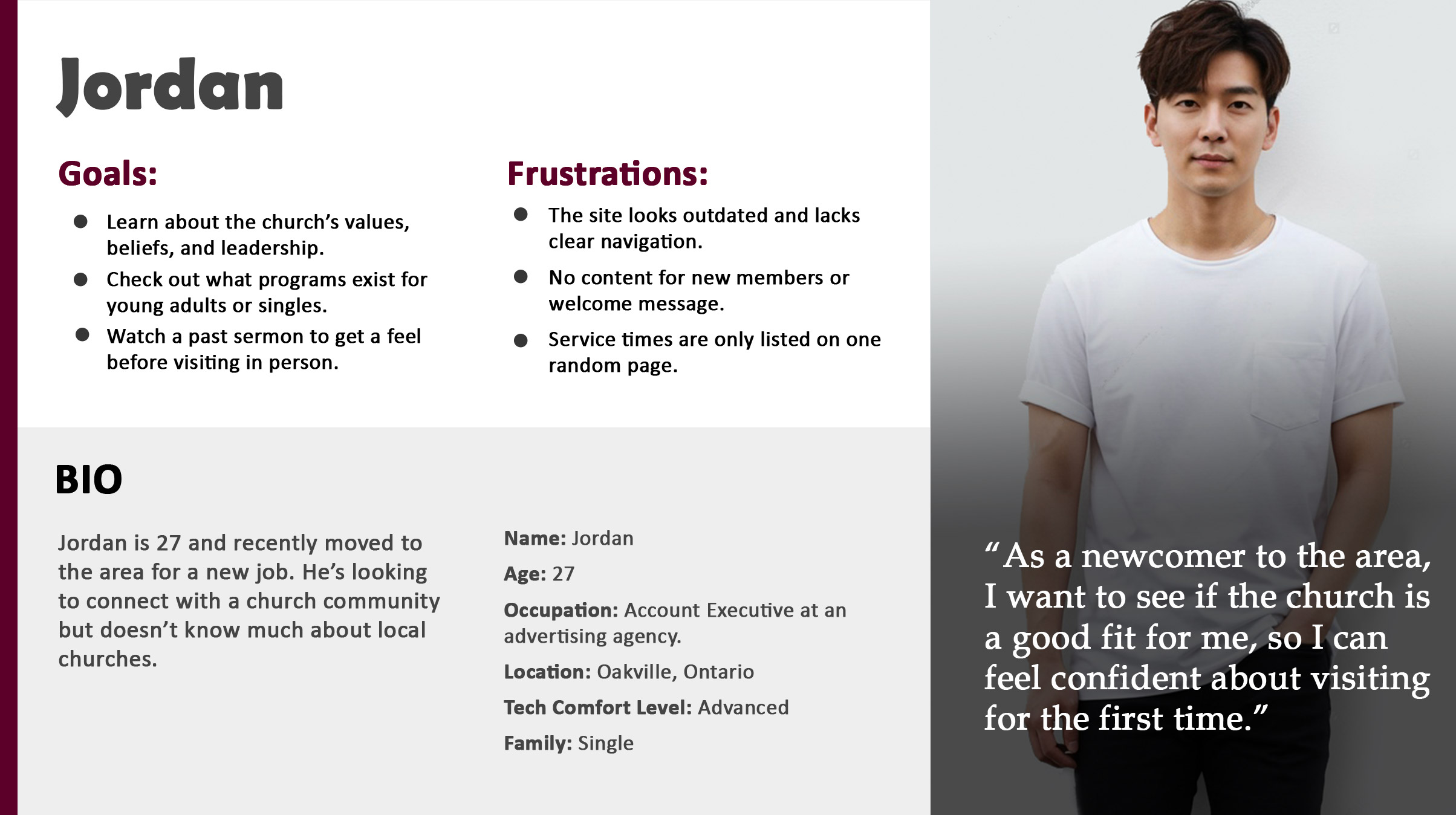
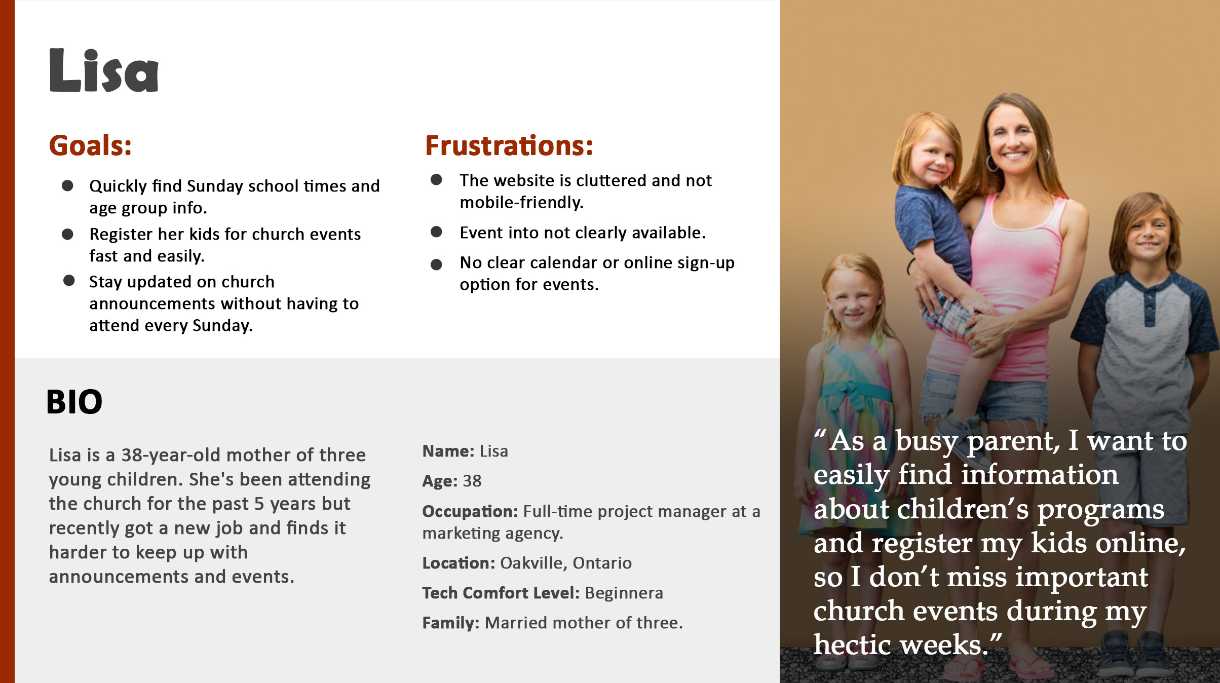
Understanding the User
User research
I began by conducting interviews with potential users to find what their needs were. I created empathy maps from those sessions. Users were mostly looking for venues for events like weddings, community events and places to worship.
Personas
Based on the user research I had gathered, I created main personas that accurately represent the spectrum of websites users.
Problem Statements
- Users cannot easily locate up-to-date service times, special events, or holiday schedules, leading to missed services or frustration.
- Prospective visitors could not find a clear description of the church's belief system and values.
- Volunteering opportunities were difficult to find.
User research summary
My first approach was to conduct extensive interviews with potential users. From the data, I created empathy maps which gave me a better understanding of their needs.
The Design Process
The church has a tight budget so I made the recommendation to search for website templates that matched their needs and specifically were built for churches. I was able to use many elements and modules from the template. Other requirements such as the news module on the main index page and archived items like services I custom designed to build a website that closely matched on my wireframes.
Competitor Analysis
By tracking competitors (churches and community centres) navigation structures, visual hierarchies and flows, I identified effective common patterns as well as missed opportunities. Additionally, it gave me a sense of the different tones, visions and branding strategies that similar churches use to communicate with members and potential new members. By doing this, I was able to uncover usability pain points, inconsistencies and accessibility problems that would lessen the effectiveness of the usability in the church website.
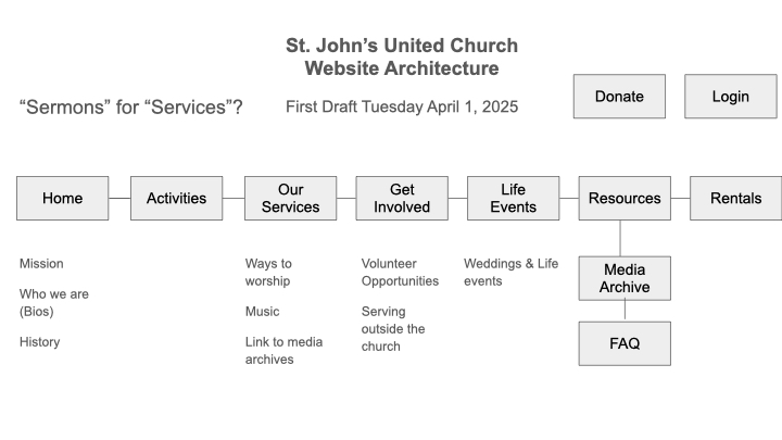
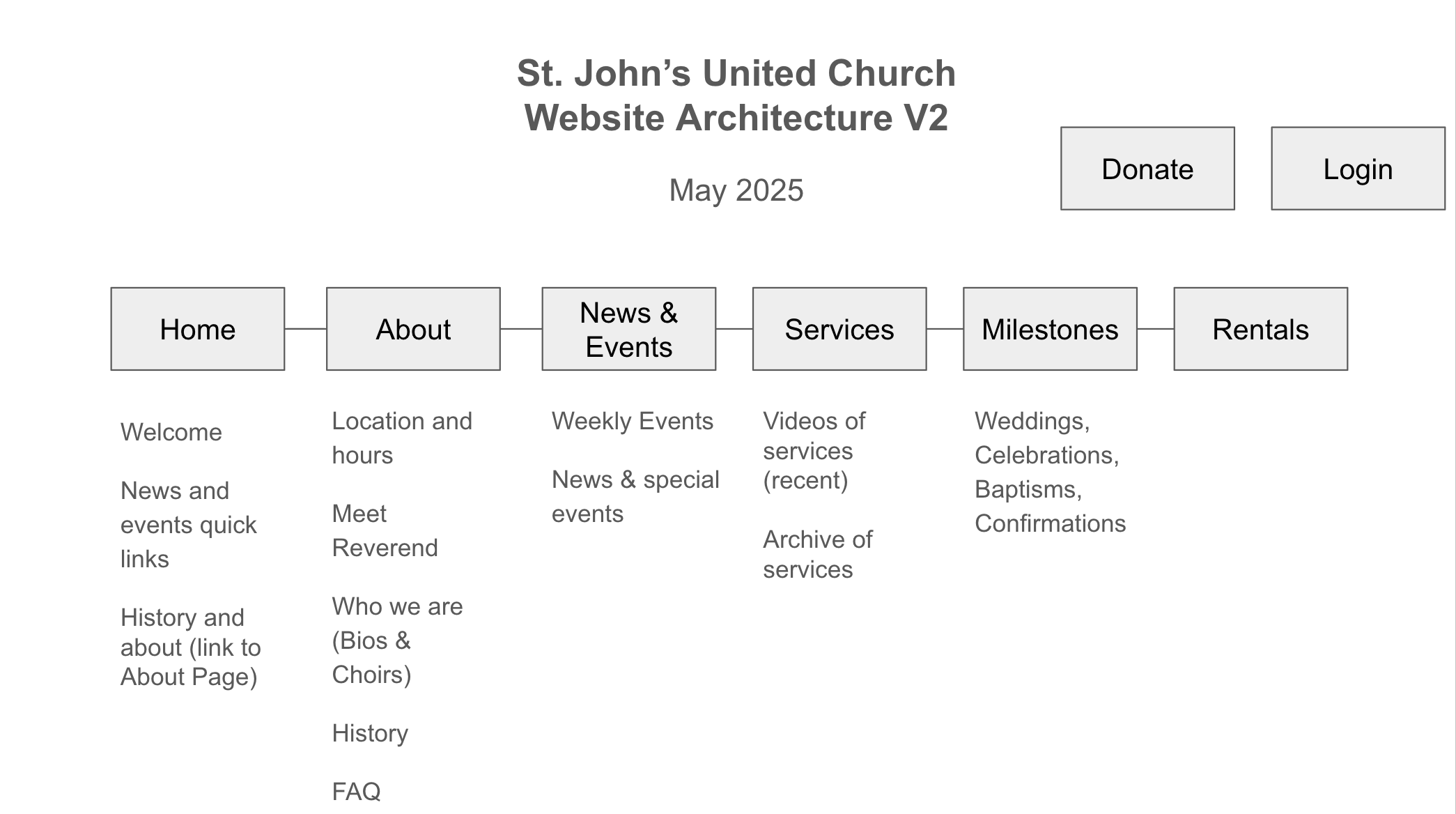
Site Architecture
From the competitive analysis, several consistent patterns emerged that directly informed the proposed site architecture. Many sites organized content around core user needs: service times, beliefs, events and ways to get involved. There were many redundancies and overly complex navigation structures where important content was buried. The resolution was a redesigned architecutre that adoped a streamlined, user-centered structure that groups content into clear, intuitive categories. My doing this, the cognitive load is reduced and prioritizes first-time visitors seeking essential information and members looking for ongoing engagement. By aligning the navigation with user intent, the architecture ensures a more accessible and welcoming digital experience that reflects the church’s mission of inclusivity and community connection.
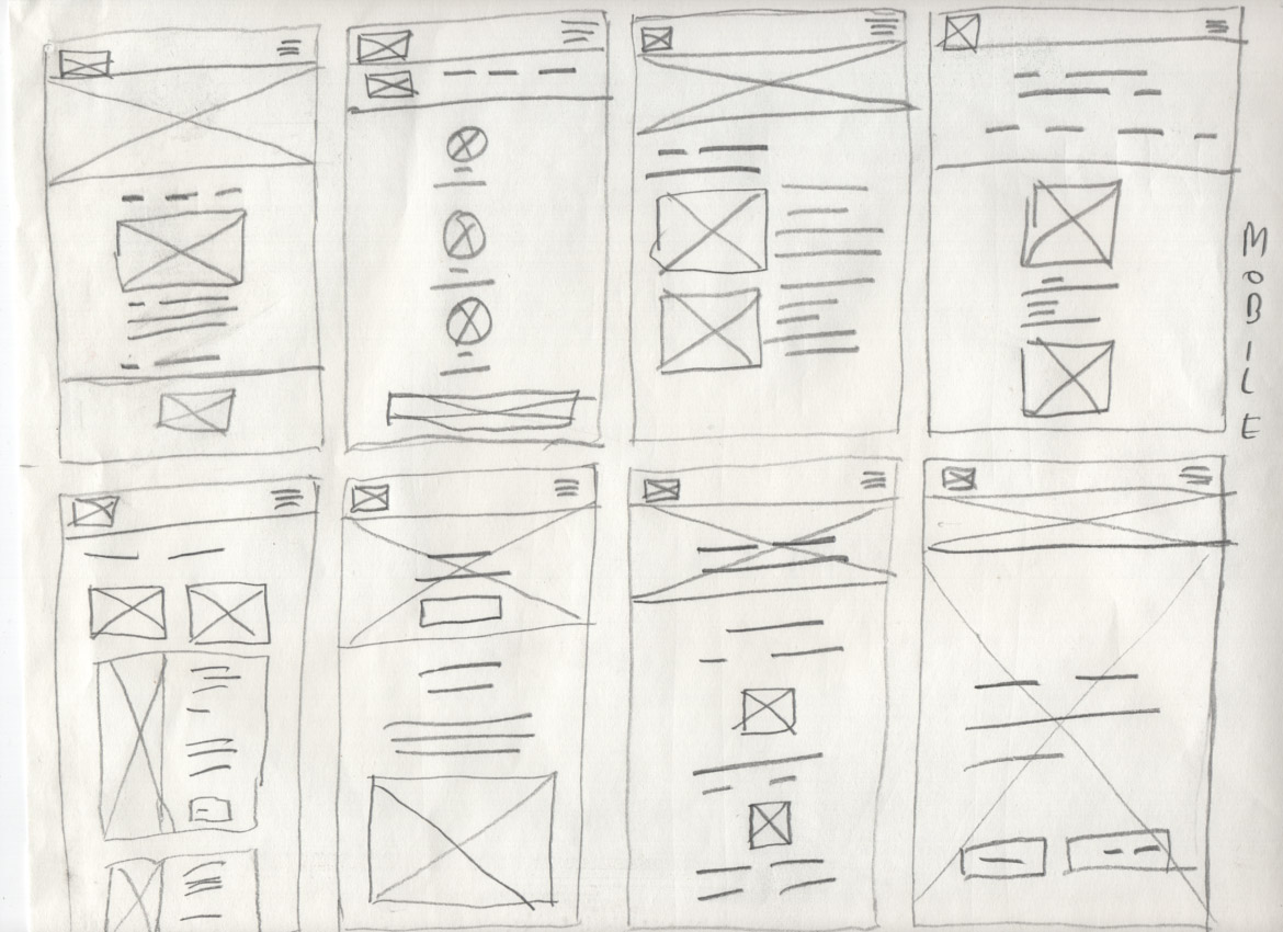
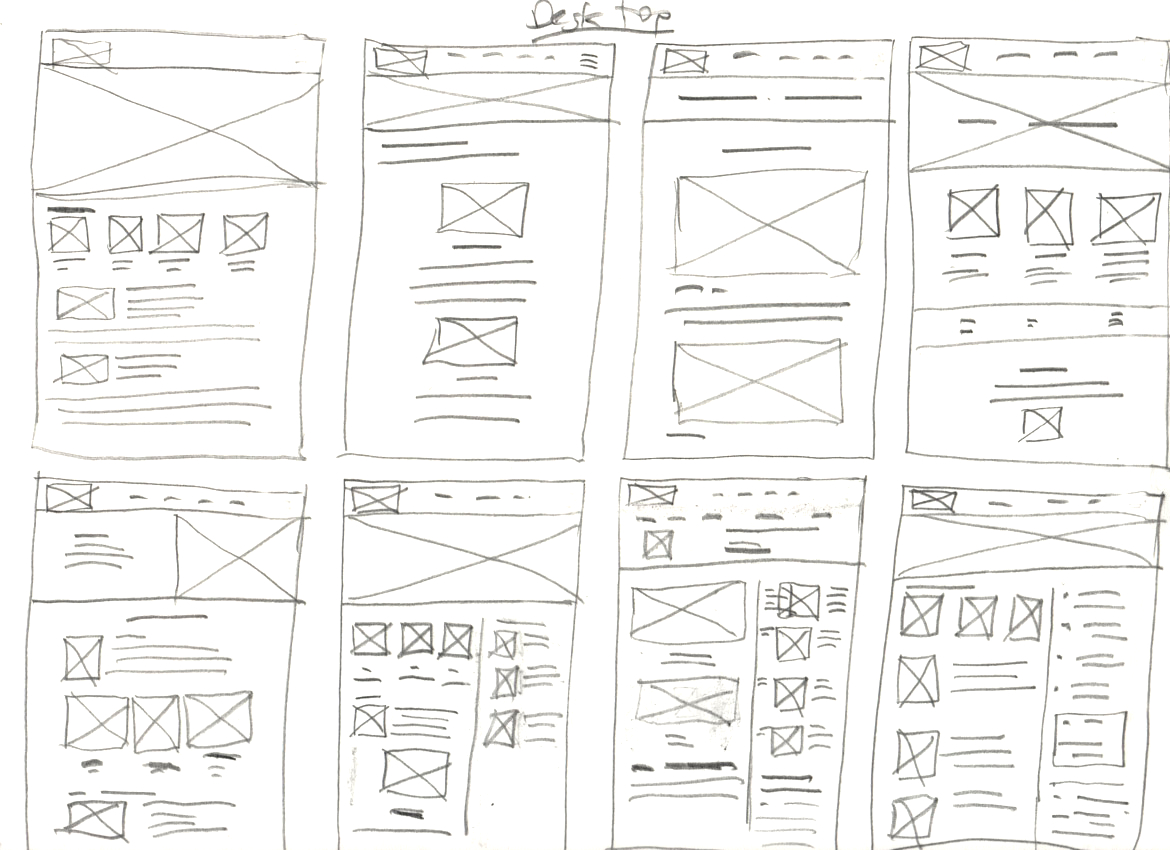
Paper Wireframes
From the interviews and competitive analysis, I began to create paper wireframes.
Low-fidelity prototypes
As the product evolved through multiple iterations, I used detailed annotations on wireframes and prototypes to preserve design intent and track design decisions.
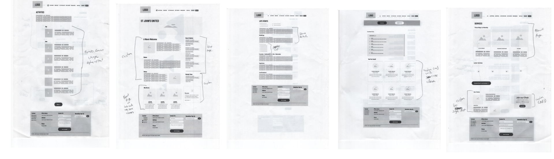
From the notes I made, I created another iteration on the low fidelity prototypes from updates of the new design.
Usability studies
Parameters
Study Type: Unmoderated
Location: User homes
Participants: 8
Length: 15-20 minutes
Findings
- Missing some calls to action
- Double calls to action on news items were confusing
Iterating the Design
Mockups
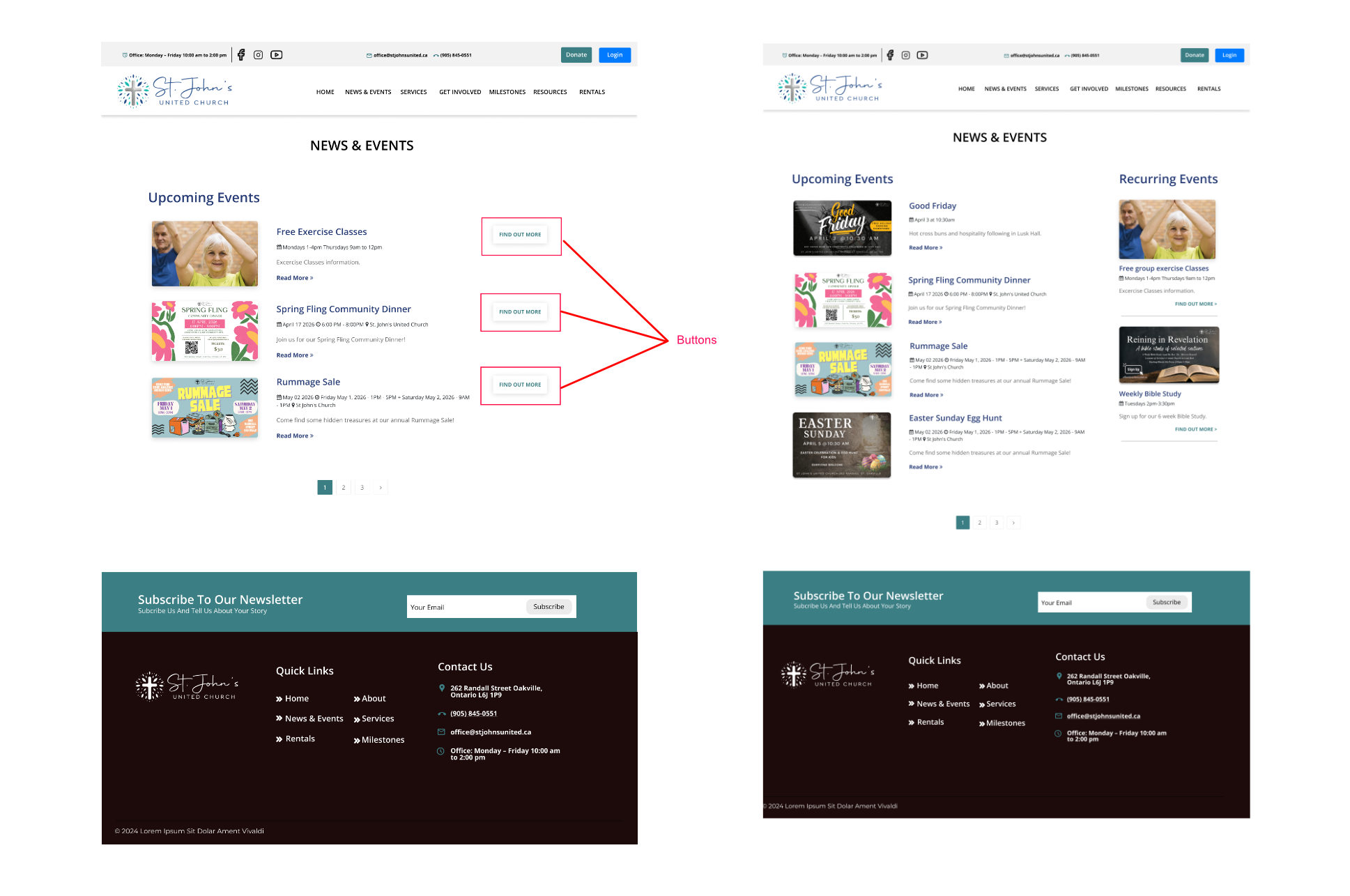
Before and after
Users were confused by the doubling of the calls to action on the news and events pages. Additionally, they could not easily distinguish regular recurring events they could join every week from news and one time events. The solution was to remove the calls to action on the right side of the page and use the space for regular recurring events.
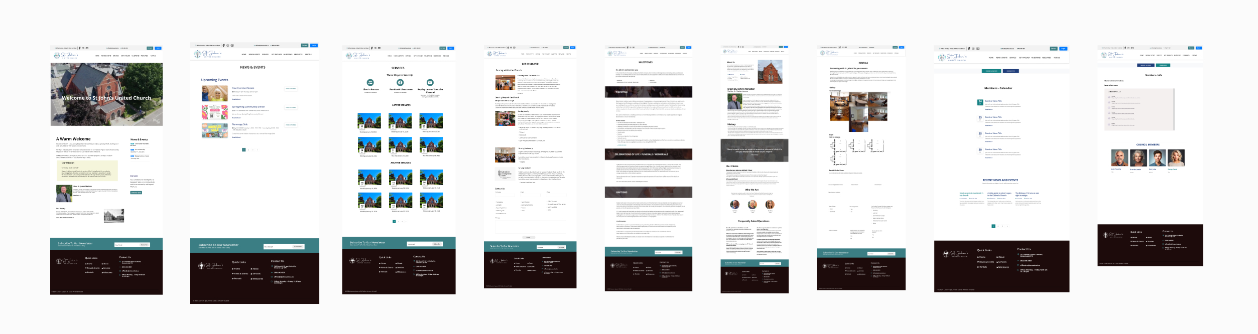
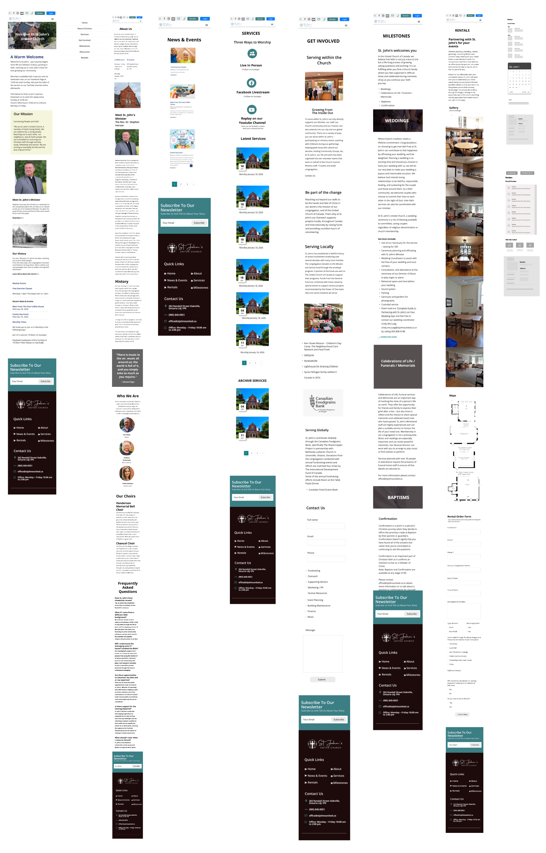
High Fidelity Prototype
From all the available research and iterations, I created the final high fidelity prototype for all the public facing pages.
Accessibility considerations
Maximizing accessibility is key to usable design, ensuring the website could be used effectively by people of all abilities. Adhering to the World Wide Web Consortium’s Web Content Accessibility Guidelines, the design emphasizes inclusive practices such as sufficient colour contrast, scalable typography, keyboard navigability and clear semantic structure for screen readers. Links, forms inputs and other interactive elements were designed with visible focus states and descriptive labels to support users who rely on assistive technologies. Accessibility considerations were integrated early and tested through multiple iterations. By prioritizing accessibility, the website not only meets compliance standards but also reinforces a commitment to inclusivity and ensures that all users can engage with the content confidently and independently.
Going Forward
Next steps
The site is nearly complete and will be finished within the next few weeks. There is still another usability study left to do to further refine and iterate the design of the member pages.