Oakville Historical Society Website redesign
UX/UI Web Design and development
Project Overview
Summary
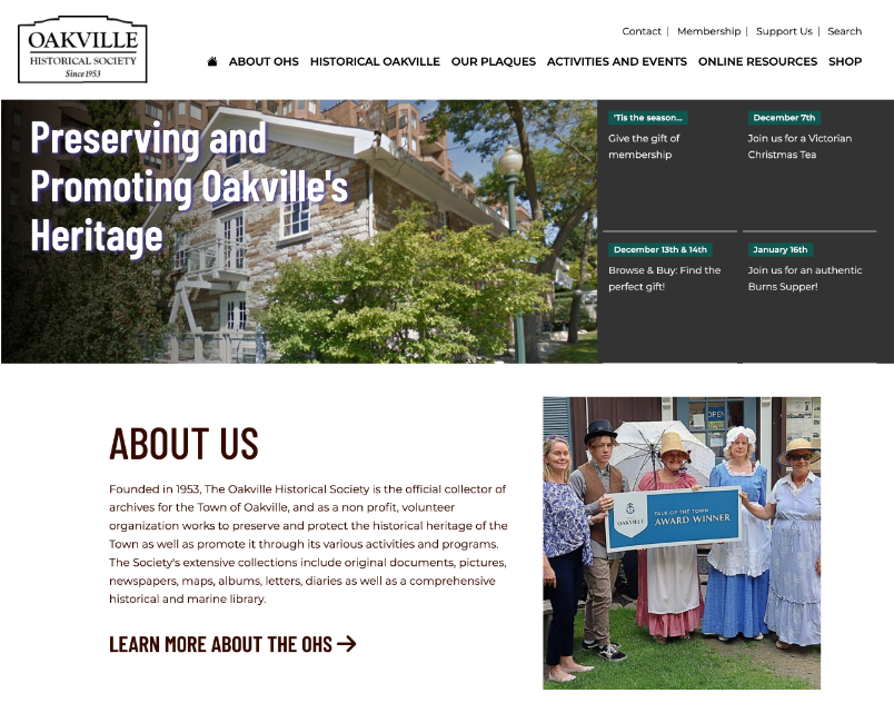
Founded in 1953, The Oakville Historical Society is run by a dedicated group of volunteers who conduct historical research, preserve historical documents, photographs and libraries and to promote the history through activities and collections.
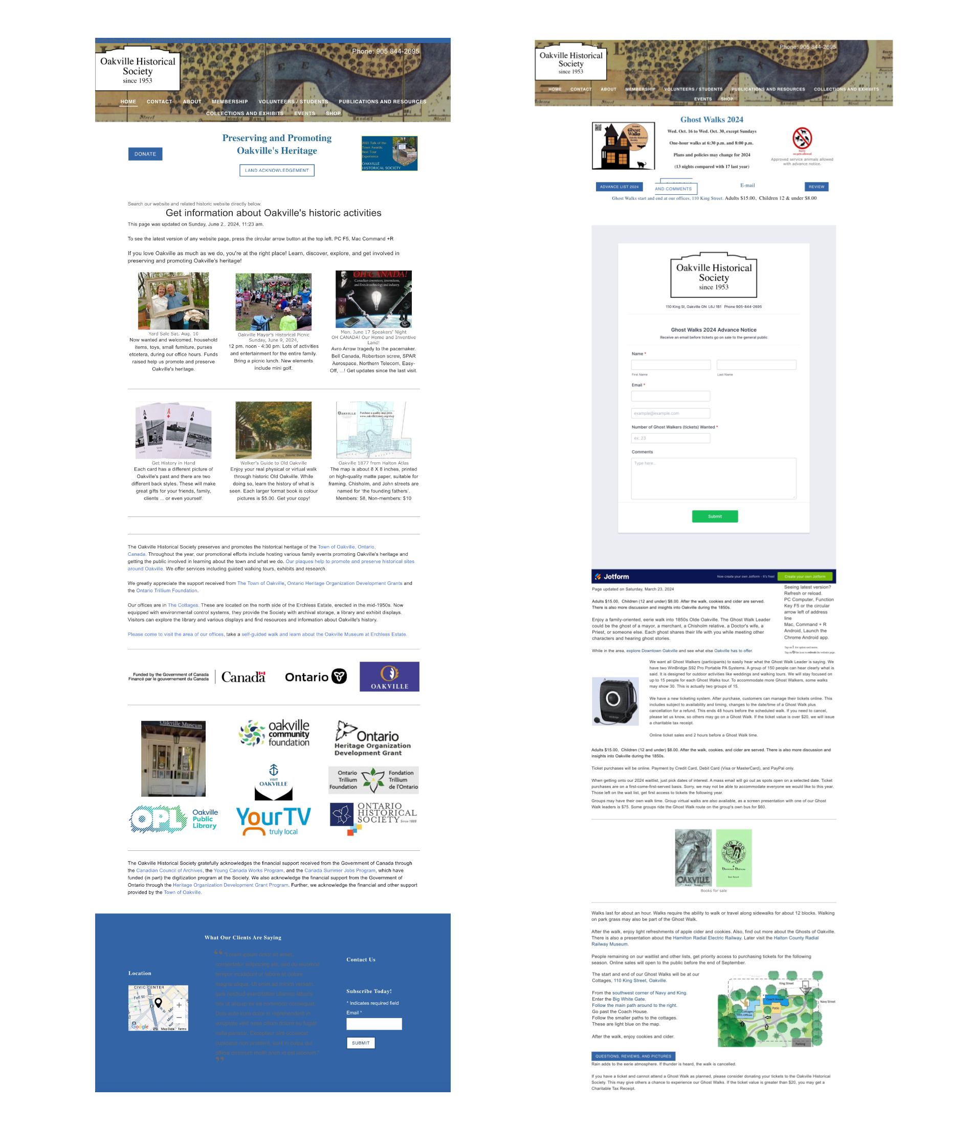
Their website was run by an outdated page builder with outdated code that did not create a positive user experience that addressed a clear hierachy, a functional site architecture or good web accessibility. A responsive website for a local historical society to provide information to all users looking for easy access to the third party historical database, activities or volunteer opportunities.
Client
Oakville Historical SocietyResponsibilities
- UX/UI Design
- User Research
- Design elements
- Web development
The Problem
Users needed to find information from the website but the content was cluttered and not well organized. There was no hierarchy or structure and information was difficult to find.The technology was outdated and there was no mobile strategy.
The Goal
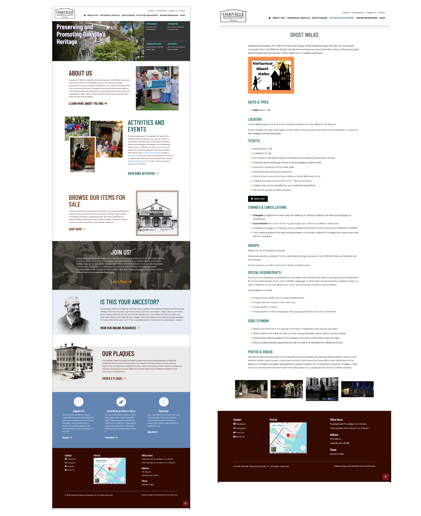
Provide a responsive website that meets users needs to find activities, online exhibits, increase community involvement and make links to external online search clear and concise.
- Content should be cleaned up with a hierarchical structure so it is more organized and easier for users to find information.
- Create a clear and simplified navigational structure that meets the needs of the OHS and their users.
- Create a website that is both flexible and scalable.
- Improve accessibility of the website so that it meets WAI guidelines.
The goal was to provide an accessible responsive website that meets the needs of users to find activities, online exhibits, increase community involvement and make links to external online archives clear and concise.
My Role and responsibilities
As a designer, my role was to create a usable historical website using data from research to focus content and make for a simpler, more concise user experience for all users across multiple devices.
In my role as UX/UI Designer, I conducted research, created wire frames, both digital and on paper, low and high-fidelity prototyping. I conducted usability studies, iterating on an accessible, responsive design to ensure a positive experience for all users.
Understanding the User
User research: summary
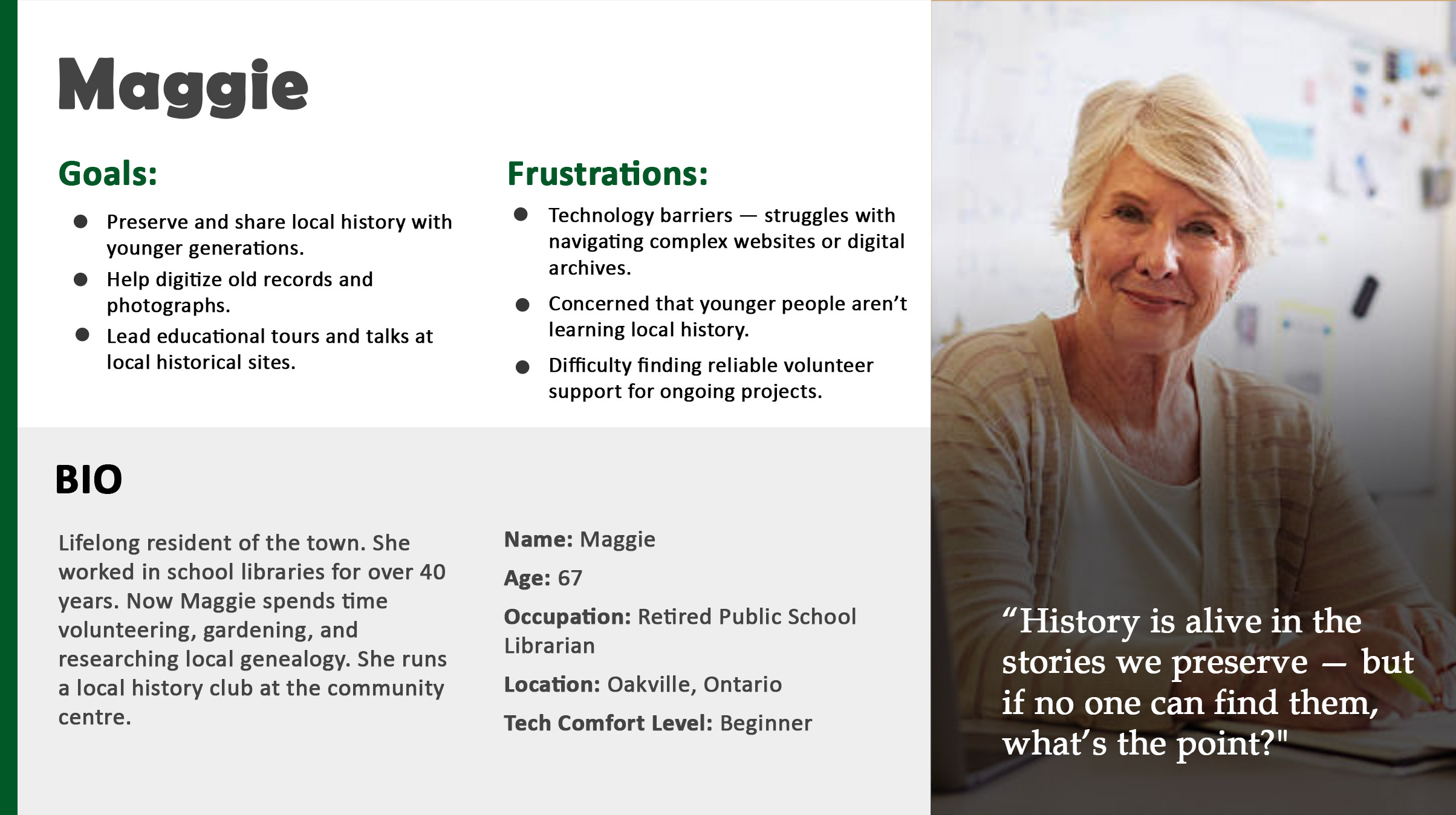
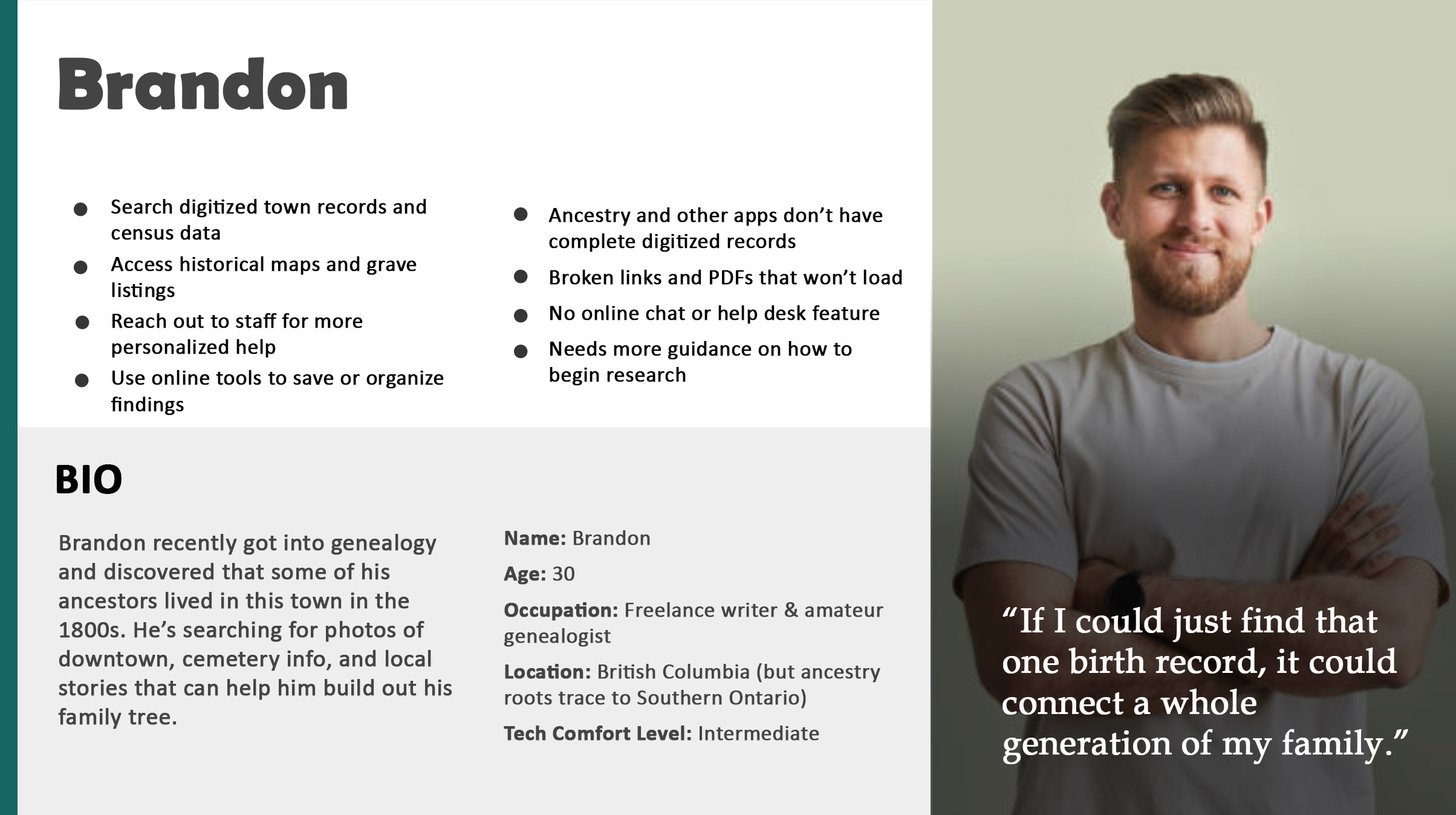
My approach was to conduct extensive interviews with users and use the empathy maps I created from those sessions to better understand their needs.
From initial surveys, I discovered that users are often looking for research for education and genealogy, family and group activities and volunteer opportunities. Some users were stressed trying to find access to the historical information database for class assignments or other research purposes.
Personas
Problem Statements
User research: pain points
Limited Resources for local historical information.
- The links to the third-party historical search databases were confusing and not clear.
Few local activities outside of sports and recreation.
- Users are looking for local historical activities and events but don’t know where to find them
Costs
- Online collections are a cost effective way to learn about history.
Local contributions
- Retirees and students wishing to fulfill volunteer hours would like more options to fill their time.
User Journey Map
I created a user journey map of user's search for local historical information from the old website and other sources they would try to help identify any pain points and areas that I needed to focus on to improve the user experience.
The Design Process
Competitor Analysis
The Oakville Historical society had its own unique goals and characteristics. I selected a wide range of historical societies from US States, European cities and more local Canadian offerings. From all these sights, I took the current directory listings and the information I gathered from these websites and created a content audit. I had access to the Historical society’s google analytics data over the course of the previous year. It was easy to spot the pages that users were spending the most time on and what pages were getting the most traffic.
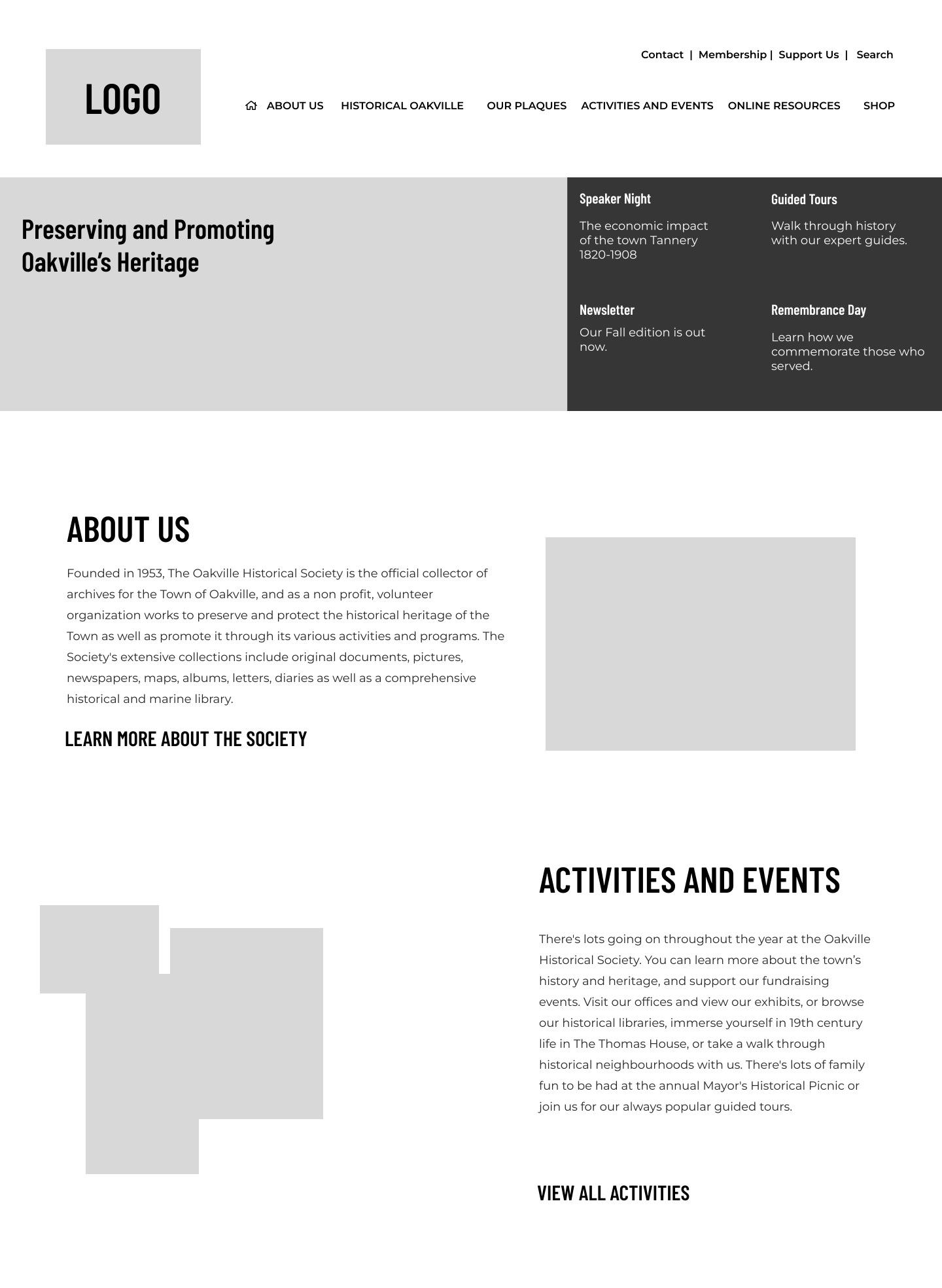
Site Architecture
I used insights from the competitive analysis to identify common site structures and naming conventions used by comparable organizations. Based on these findings, I developed an initial information architecture and refined it through several iterations.
To validate the structure, we conducted user surveys to test how easily participants could navigate and interpret the proposed categories. Feedback revealed confusion between the sections labeled “Collections” and “Exhibits.” To improve clarity and better reflect user expectations, these were consolidated under a single category, “Online Resources,” which more directly communicated the type of content users were seeking.
As the structure evolved, the primary navigation also began to grow beyond a manageable length. To address this, the navigation was reorganized into two groups: general public-facing pages and a separate set of administrative categories. This adjustment helped streamline the main navigation and made the site structure clearer for both visitors and administrators.
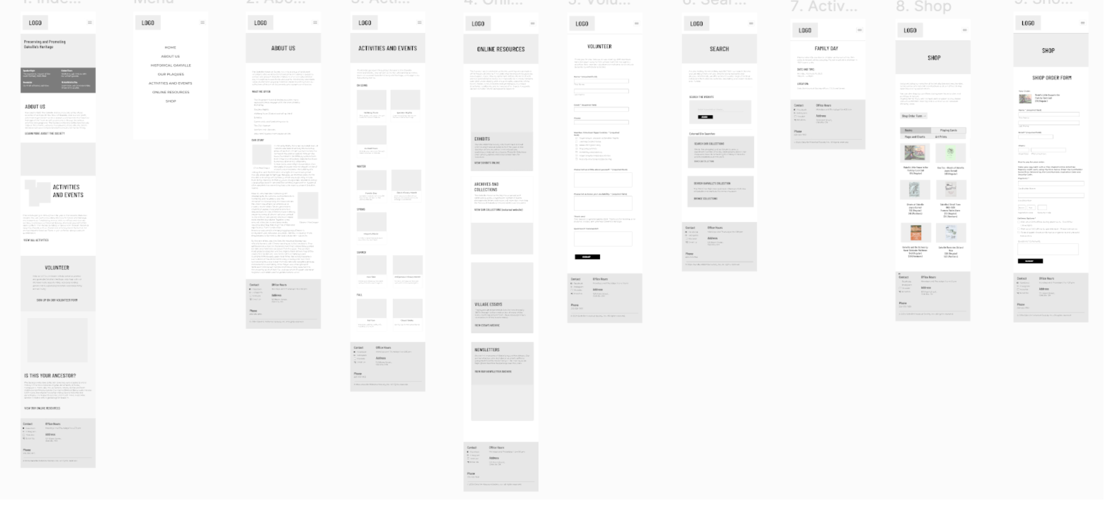
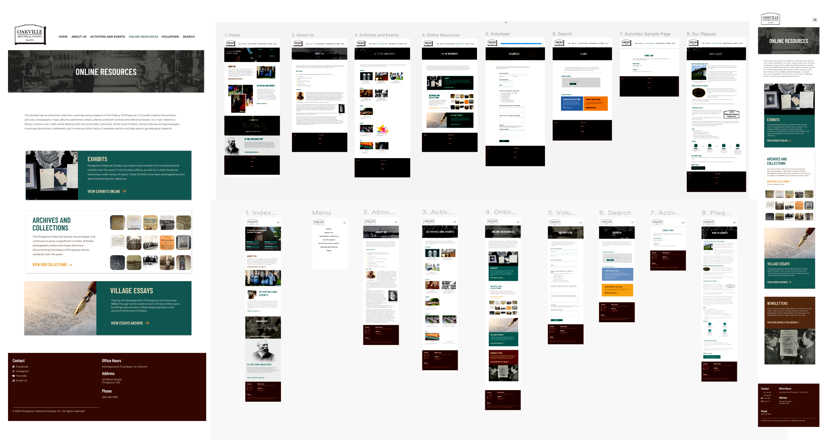
Paper wireframes
Using the sitemap as a starting point, I drafted many wireframes from all the templates. After multiple versions of each page that I needed for the website from my information architecture.
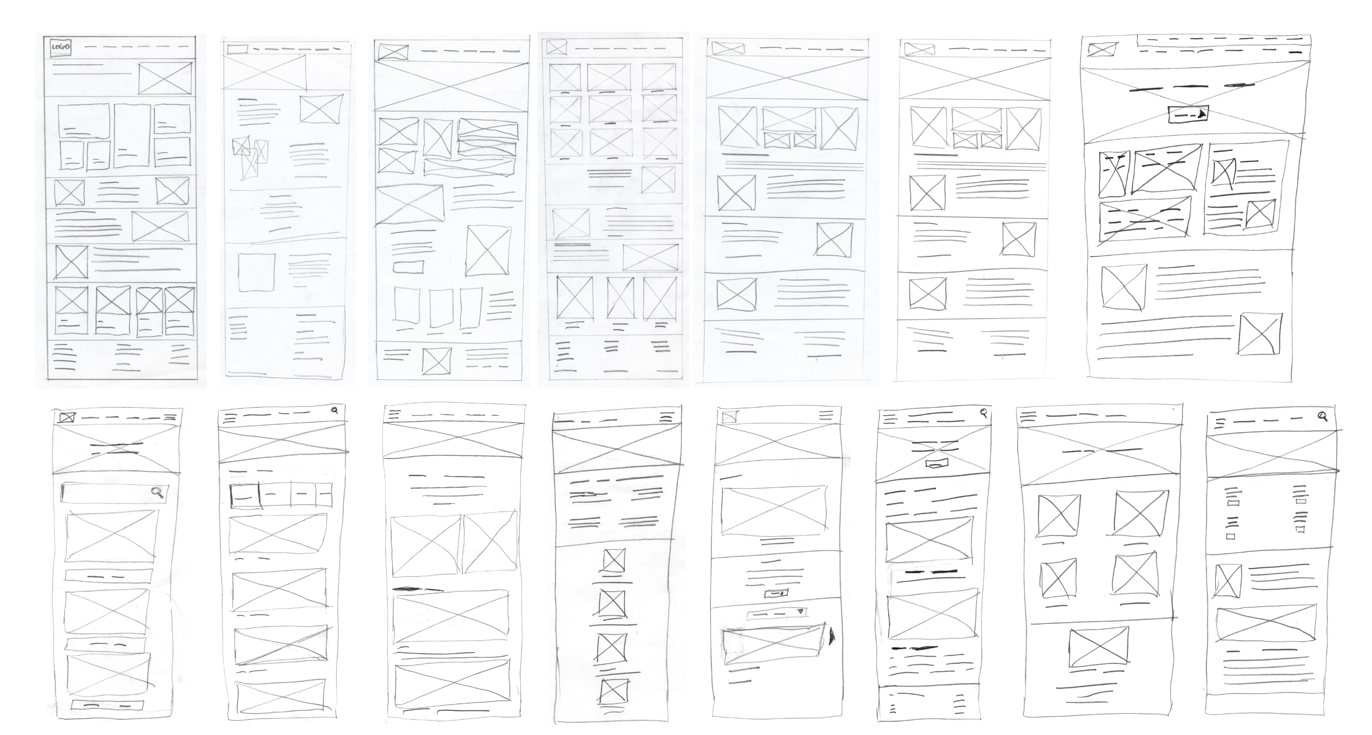
Paper wireframes screen size variations
After many iterations, I drafted multiple versions of each page that I needed for the website from my information architecture.
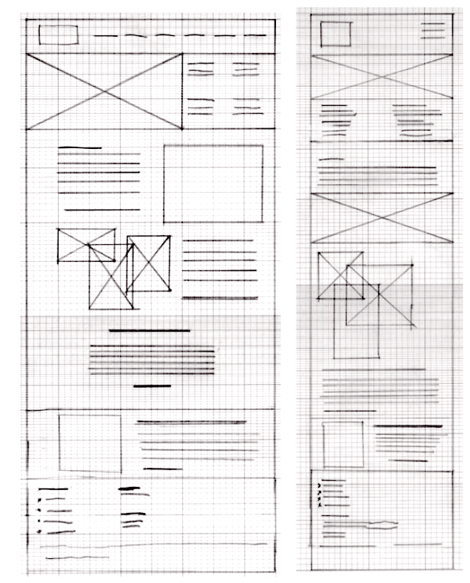
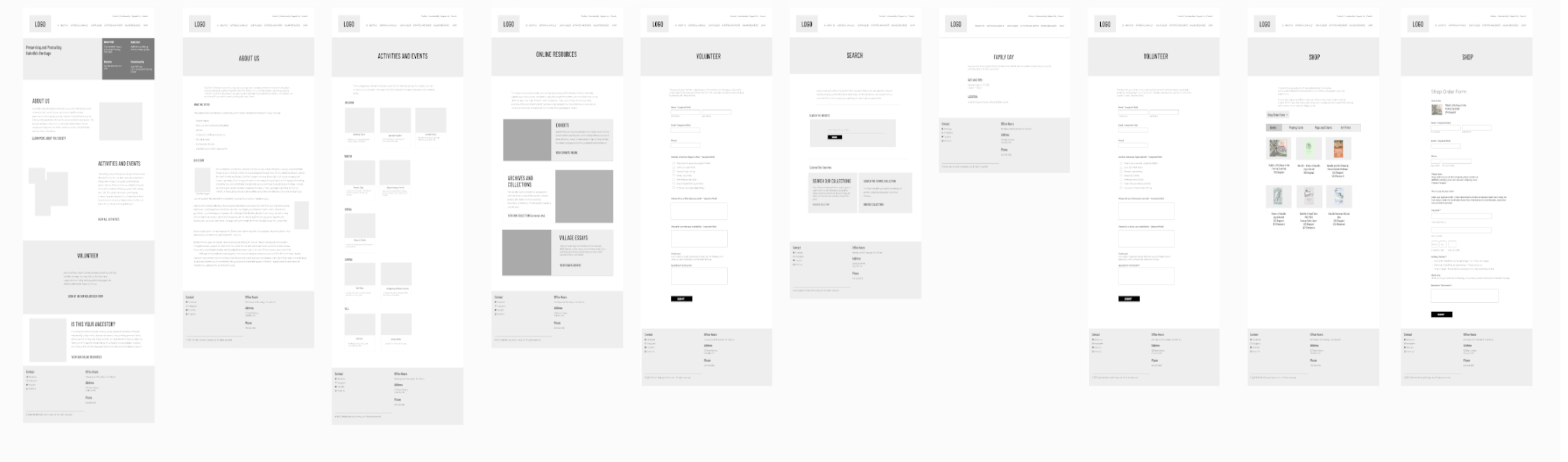
Digital Wireframes
After putting my ideas on paper, I began to make low-fidelity wireframes. Many iterations later, I created these wireframes that best represented user flow and met user needs.
Low-fidelity prototypes
Once I had the user flow diagram and wireframes, I tested the functionality before adding it to the final designs to ensure accessibility for users.
Usability studies
A moderated usability study was conducted on site with five participants. Each participant took about 10-15 minutes each.
Usability Study: Findings
The Study found three key findings that were common to all users.
- The news module didn’t have good contrast and it took up too much space on the page and the space for text was limited.
- A clearer hierarchy on the activity page was needed. Users were looking for things to do within a limited time. Breaking up content by seasons and adding appropriate headings contributed to a seamless experience.
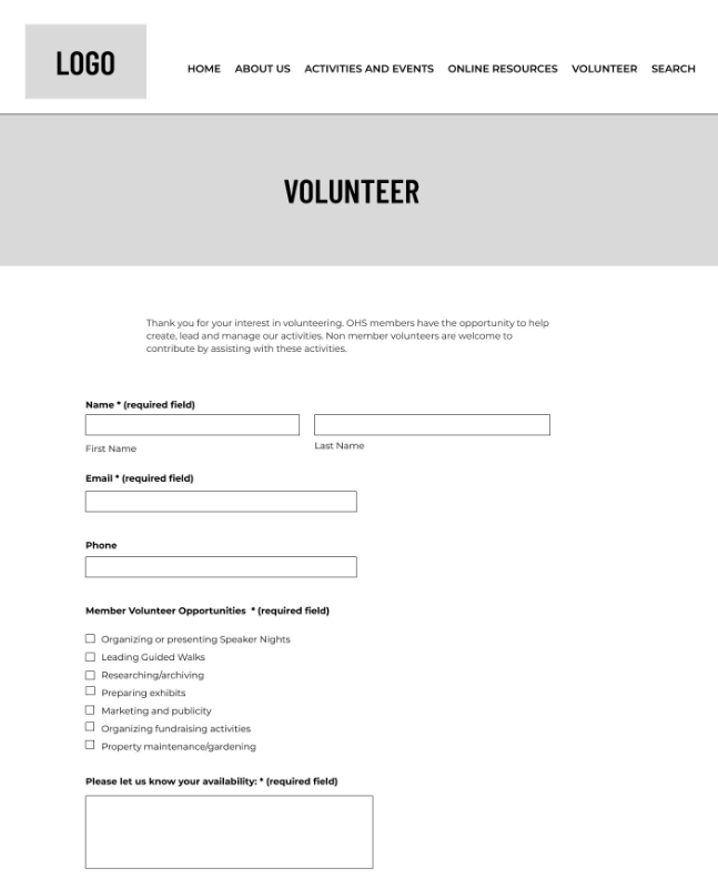
- Users could only select one option from the volunteer form. Changing the options to checkboxes fixed the problem.
Refining the Design
Mockups
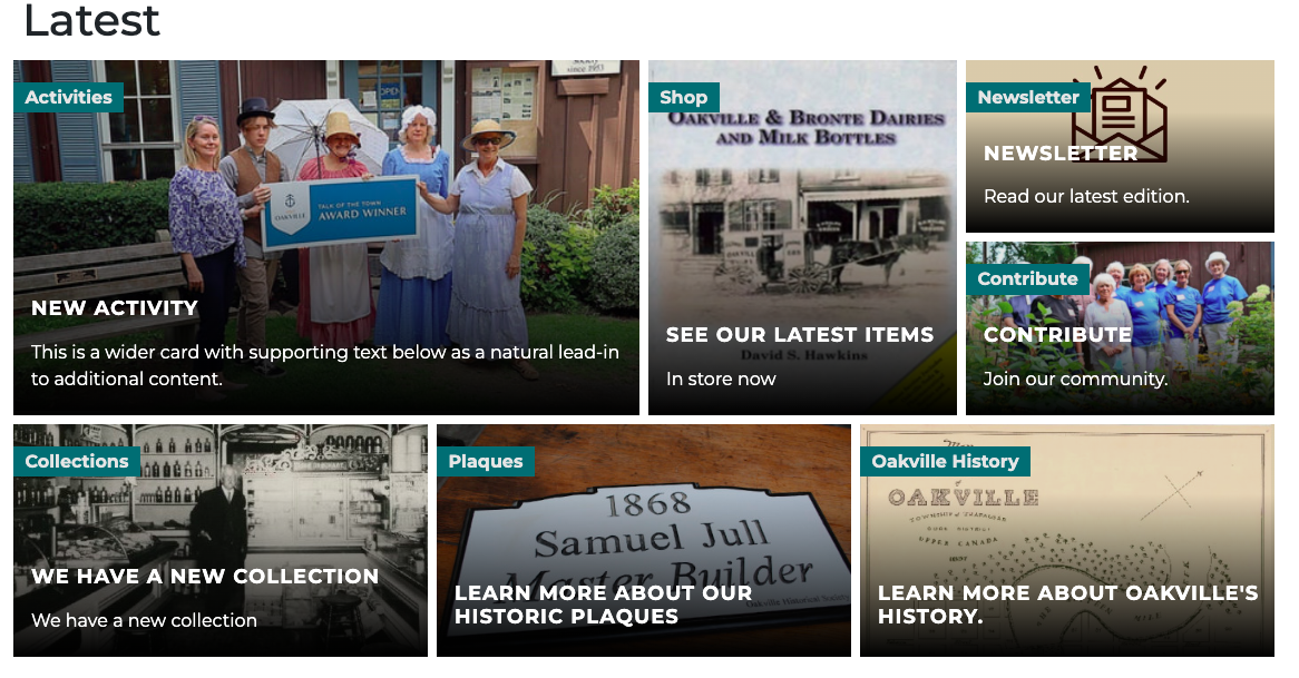
Users found the news module overwhelming and often didn't scroll down past the banner. News module layout was redesigned to be text and moved up next to hero image to keep it above the fold.
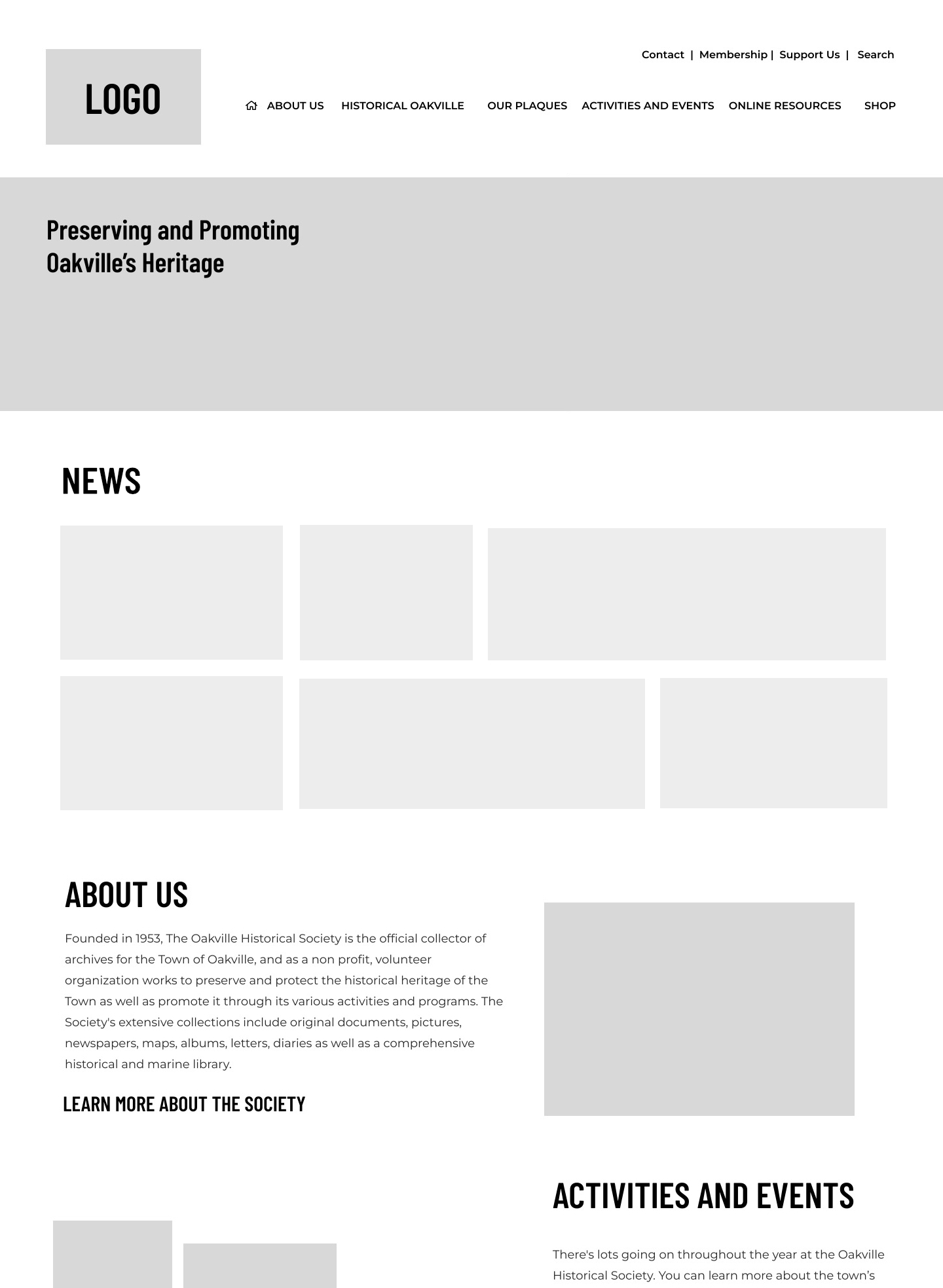
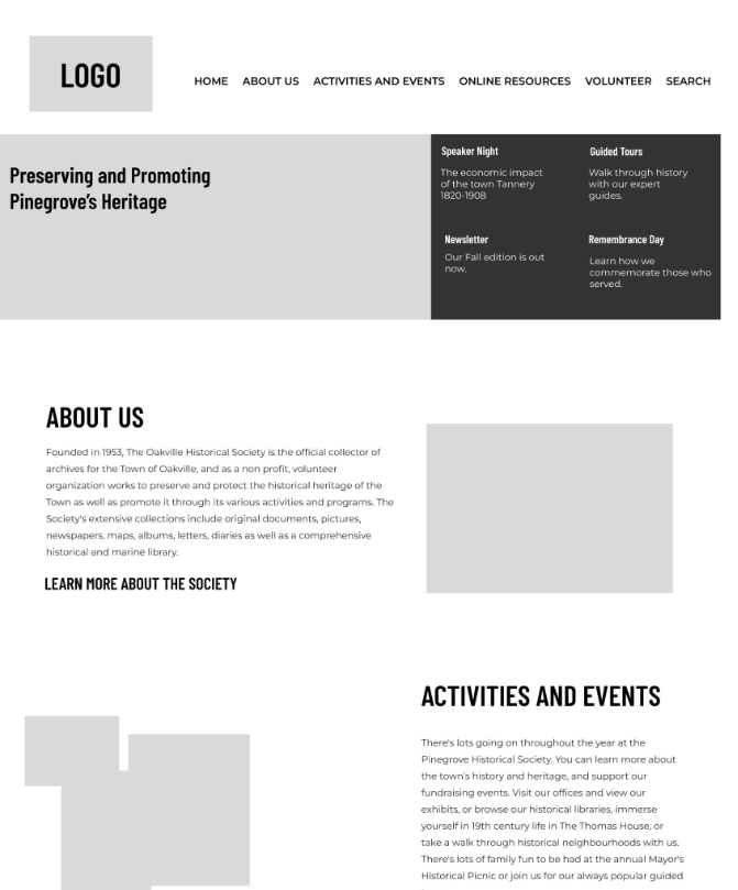
High Fidelity Prototype
When the low-fidelity prototype was complete, I began working on the high-fidelity prototype. Using a palette I took from historical buildings, I began creating a design that was clean and intuitive, with images that were taken from the
town’s archive.
The colour palette went through several iterations to meet with WCAG AAA specifications ensuring the contrast ratio between background and foreground is at least 7:1
I used two typefaces: Barlow Condensed for the headings and Montserrat for the body text. They are both clean, easy to read fonts. Keeping the hierarchy simple creates an easy to scan site allowing users to find information on the pages easily.
The content was designed with a simple hierarchy in mind for screen readers. The text was spaced with potential resizing of the text for accessibility.
Going Forward
Impact
The strategy I employed was to create a user friendly website from an older website with many redundancies and no clear information architecture and little accessibility. The new design is more focused and more attentive to the needs of users whose age range is between 25-65 and meets accessibility requirements.
- Ghost walk orders were up.
- Users were able to find what they were looking for. The tracking data shows a 30-45% increase in historical searches.
- Store items, activities and orders can be done in 2-3 less clicks.
What I Learned
While designing this website, I learned that by taking the research and design processes in small steps really helped me focus more clearly on the needs and goals of the users. I learned now invaluable research is in making the end goals more attainable. It also creates a mindset where improvements can be seen easier and earlier.
Next steps
The OHS is planning on incorporating more exhibit and collections content on the website. This involves more wire framing, user surveys and user testing.
Still to do
Due to budget constraints, the Oakville Historical Society was not financially able to implement a full e-commerce solution for the website. We had to compromise with online forms, and though it worked fine for simple transactions, it proved to be difficult for users who wish to purchase more than one item. And though the stats showed that users wishing to buy more than one item fell below 2% of all purchases, a better solution for the shop section will be researched and tested in the coming months.